Understanding Color
Robert Meganck, Matt Wallin, Peter Martin
Although color is a concern of disciplines as diverse as art, science, business and medicine with applications ranging from the breakfast cereal industry to the Pentagon, it is arguably one of the most misunderstood yet most used visual principles. To truly understand color and the many ways it can be used to benefit mankind, one would need to have knowledge of physics, psychology, sociology, chemistry, ophthalmology, neurology, art and art history.
This misunderstanding may stem from the fact that most people believe color is a physical property rather than the perception and interpretation of visible wavelengths. These wavelengths can either come from a light source directly or can be modified by their passing through a semi-transparent object. The misunderstanding is compounded by the fact that we lack a common language to accurately identify color.
Even those who use color daily misunderstand many basic principles of color theory: where and how color is generated; how it interacts with an object; how a person interprets the incoming light wavelengths to generate a perceived color; and how color perception is produced and manipulated in various media. Adding to this problem is the absence of a universal language that accurately defines and articulates the essence of color science and color math.
We have a very limited vocabulary to describe the many million colors detectable with human vision. Although the ability to create and view objects in virtual space (three-dimensions) has been readily available for decades, color systems are still being presented as two-dimensional or as two-dimensional depictions of three-dimensional models.
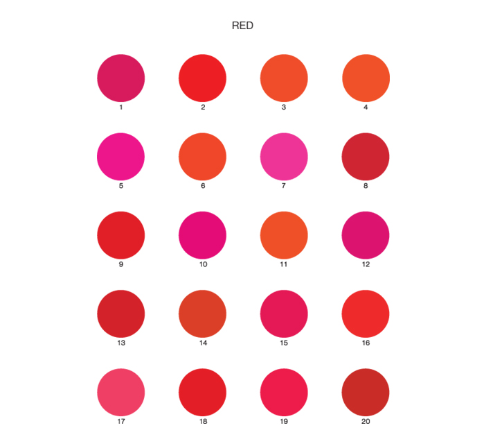
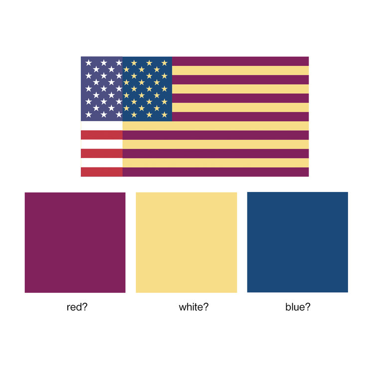
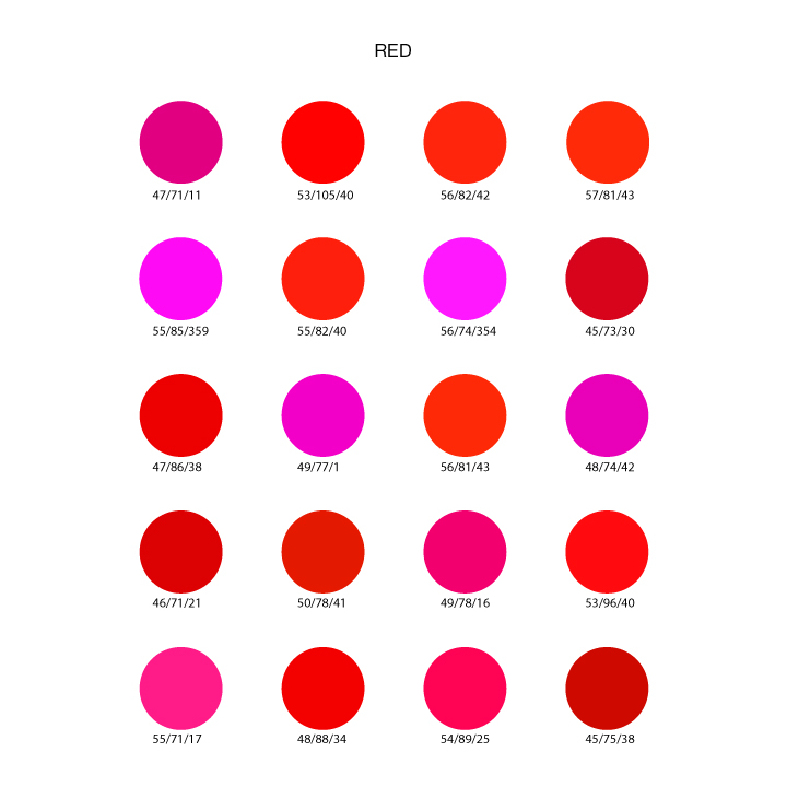
Figure 1 contains 20 circles. Each circle can be recognized as a different color, yet each also can be identified as a “red” circle. When we use common names like red, blue and yellow to identify a color, we are referencing a very broad collection of colors and forcing each unique color into a larger group. We do this because we lack a language to identify colors more specifically. If you were to ask someone, “What are the colors in the American Flag?” most would say red, white and blue. As there are many different reds, whites and blues, it might be better to say that the American flag consist of reddish, whitish and bluish colors.
Figure 1 contains 20 circles. Each circle can be recognized as a different color, yet each also can be identified as a “red” circle. When we use common names like red, blue and yellow to identify a color, we are referencing a very broad collection of colors and forcing each unique color into a larger group. We do this because we lack a language to identify colors more specifically. If you were to ask someone, “What are the colors in the American Flag?” most would say red, white and blue. As there are many different reds, whites and blues, it might be better to say that the American flag consist of reddish, whitish and bluish colors.
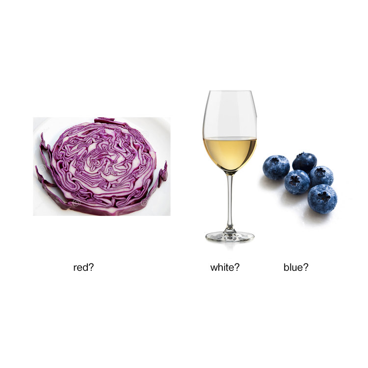
Although the objects in Figure 2 are identified as red cabbage, white wine and blue berries, we do not associate this specific red, white and blue with the colors in the American flag (Figure 3). If you were to ask someone to define the word flag, he/she might reply that it is a banner that represents a specific entity, such as a country or organization. If you were then to ask the same person to define the word “color,” he/she might not be as quick to respond, or he might say something like: “You know, it’s like red or blue,” which actually is a better description for hue than color. The fact is that although we talk about color on a daily basis to help us navigate our world — to tell when a piece of fruit is ripe, when a child is sick, or if we can expect it to rain — most of us really cannot really say what it is.
We all learn our color in basically the same way: Someone (perhaps a parent or teacher) shows us an image or points to an object and identifies it as having a certain color. In turn, we come to recognize all things that reflect that part of the visible spectrum as having the same color, and we assign it a name. However, scientists believe our brains react differently to different wavelengths and that we all don’t see the same color.
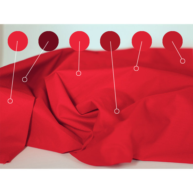
Figure 4 shows what most of us would identify as a piece of solid red fabric, however it is easy to see that this “solid” red consist of a number of different hues.
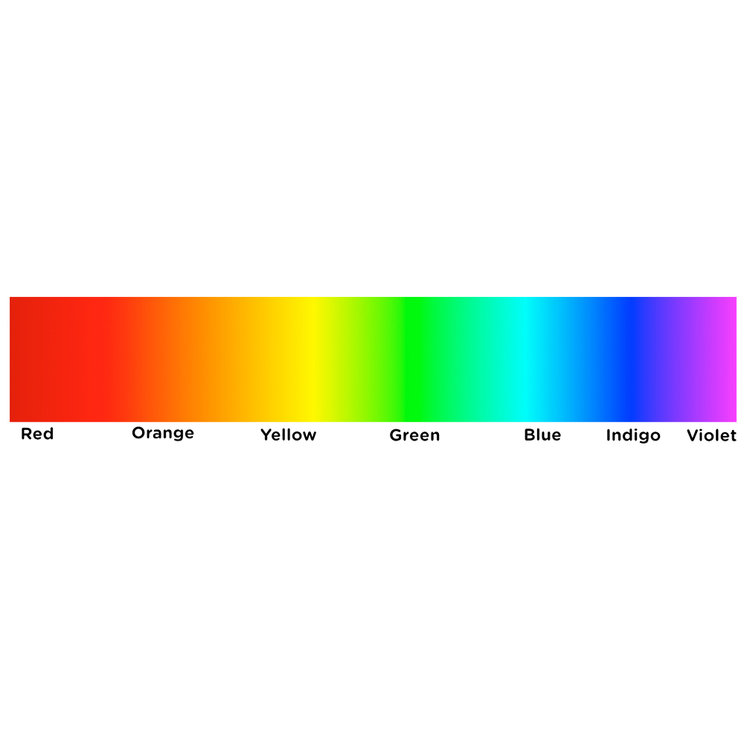
The education of students on color diverges significantly from the reality of color perception. For years, students have been taught that the colors in the visible spectrum are red, orange, yellow, green, blue, indigo and violet (ROYGBIV), as identified by Sir Isaac Newton in the 17thcentury. But anyone viewing the visible spectrum can easily see a subtle array of colors (Figure 5). This small part of the entire electromagnetic spectrum is called "visible" since it is the section to which the light-sensing cells in the eye can respond.
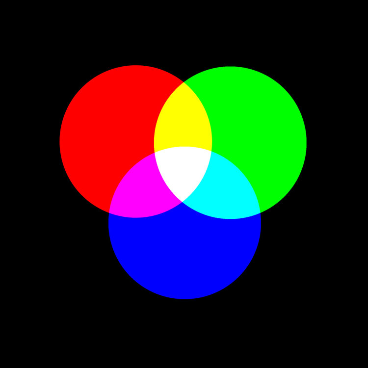
Further, art students, who are exposed to more sophisticated color theory, are taught that the primary colors (colors that cannot be mixed from other colors) are red, yellow and blue (subtractive primaries) (Figure 6, On the other hand, physics students are taught that the primaries are red, green and blue (additive primaries) (Figure 7). It is as if these two systems are mutually exclusive.
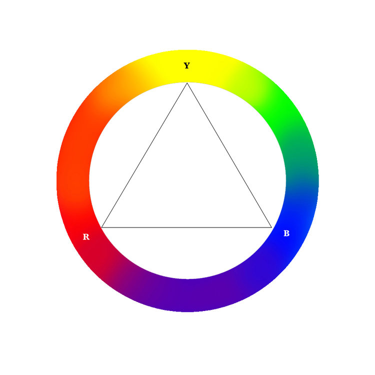
A basic problem in teaching such a subtractive system to art students in particular is in identifying which red, which yellow and which blue are being referenced, as different reds, blues and yellows produce different mixed colors. For example, using, say, cerulean blue instead of cobalt blue to mix with yellow will produce very different greens. Color identification by means of common names (red, blue, yellow, etc.) is inadequate for the identification of the full spectrum of colors.
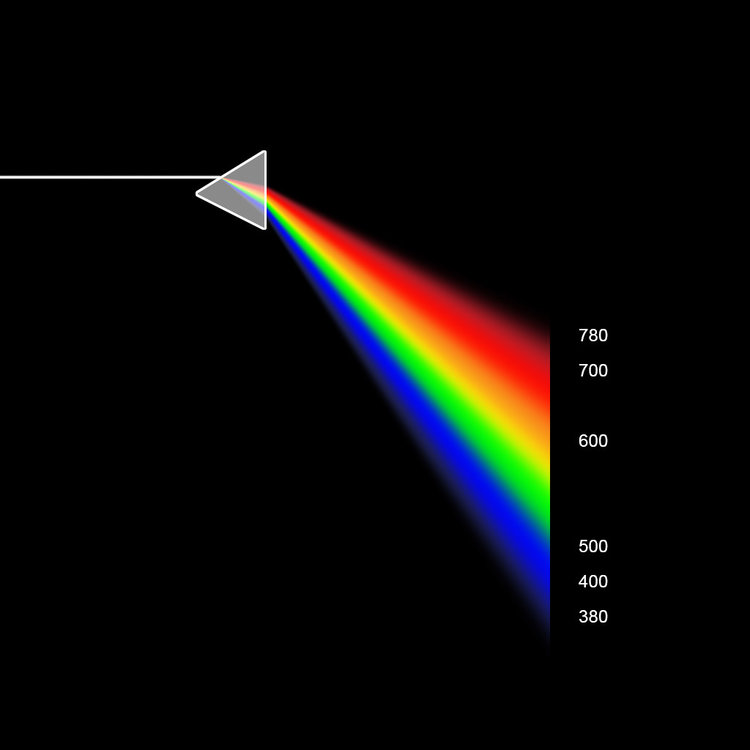
Sir Isaac Newton went on to explain that color was a property of light. By splitting light into various wavelengths using a prism, he produced the full range of colors in the visible spectrum (Figure 8). By adding a second inverted prism and recombining the full range of color, Newton went on produce white light again.
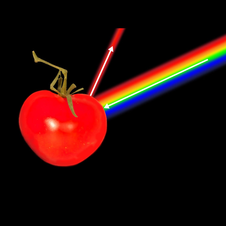
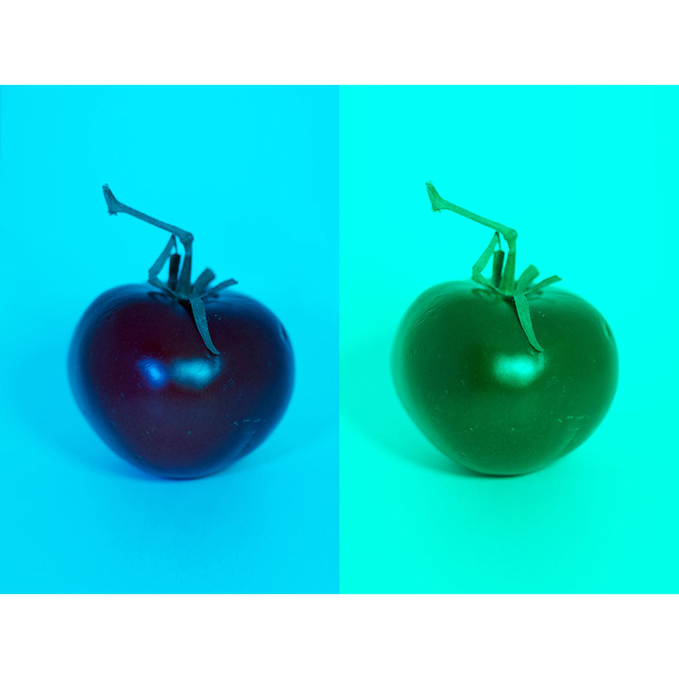
It is important to understand that color is not an inherent property of an object but that color is in light. A tomato appears red because its surface reflects that portion of the visible spectrum and absorbs most of the other portions (Figure 9). If the same tomato is illuminated by a blue or green light (which generate light from only part of the visible spectrum), the results are quite different. (Figure 10)
When we talk about color it also is important to identify the type of color to which we are referring.
Pigment color: The physical properties of an object that cause it to reflect certain parts of the visible spectrum and absorb others.
Radiant color: Pigment color as it has been affected by light. (Figure 11)
Interactive/Perceptual color: Color that appears different as a result of its surrounding colors. The color bar that runs through the center of Figure 12 is a consistent color. Its pigment and radiant color do not change. What changes is our perception that the color gets darker as it moves from left to right.
Interpretive color: Color associations that are devoid of physical principles and rely on sociological factors. When we see red and green together, we think Christmas. When we see black and orange, we think Halloween. In the United States, we associate black with death and white with weddings. In traditional China, both black and white are used for death, while red is the color for weddings.


Vision
Color is the brain’s response to lights of different wavelengths. These enter the eye, activating the color-sensitive cells (the cones) in the retina. The resulting electrical signals are sent to the brain where they are interpreted relative to a person’s lifetime learning experiences and the entire image that was detected by the retina. There are three different types of color-sensitive cones in the eye, and each responds to different — but overlapping —regions of the visible spectrum. The visible spectrum ranges in a continuous fashion from red and corresponds to the colors that appear in a rainbow when light from the sun is dispersed by raindrops. Additional receptors, called rods, on the retina are responsible for interpreting value — the lightness or darkness of an image and are responsible for night vision.
The lens at the front of the eye collects and focuses light waves onto the light-sensing cells in the retina. These then send signals through the optic nerve to the visual cortex where these signals are interpreted. (So, when you were little and you mother told you that she had eyes in the back of her head — she may not have been far from the truth.)
Mapping Color
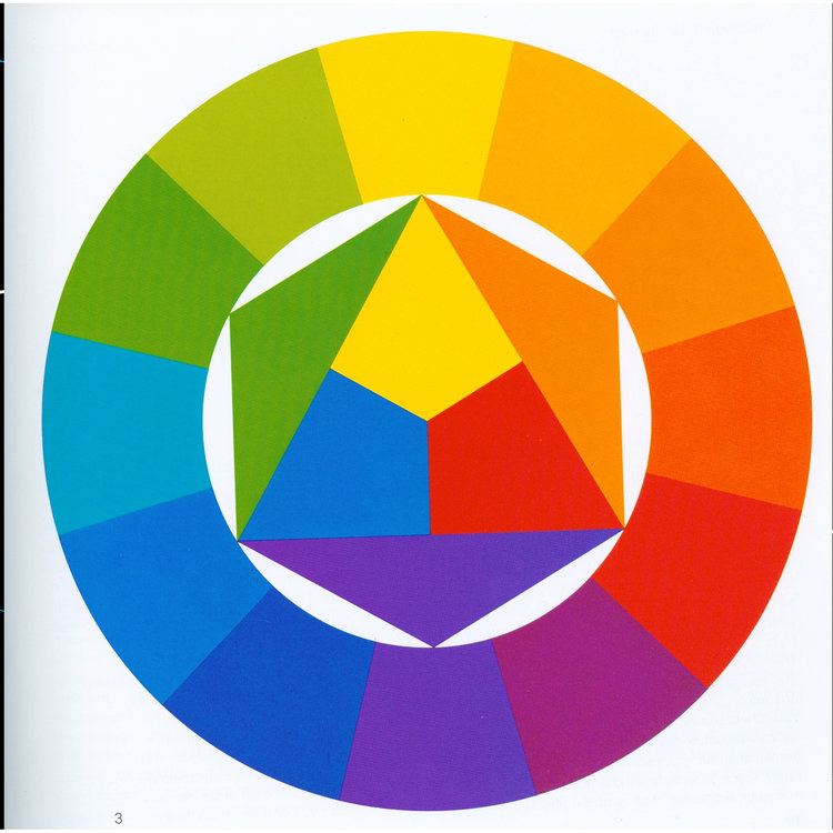
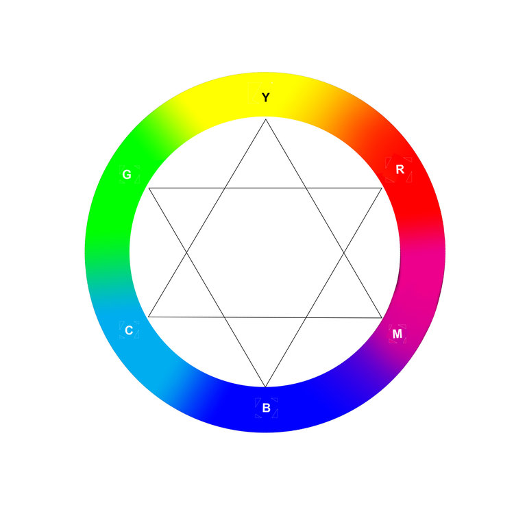
Sir Isaac Newton first proposed a color wheel in 1704. He did so by bending the visible spectrum around the circumference of a circle. Then he added the missing color ranges that include purples and magentas by blending in the red and violet ends of the visible spectrum. More recently, others, including Johannes Itten, color instructor at the Bauhaus from 1919 to 1922, have modified the basic color wheel. These wheels provide a means for us to understand color relationships — analogous colors (colors next to each other on the wheel), complementary colors (those opposite each other) — and form the basis for most "harmonious" color pallets (complementary, split complementary, quadratic, etc.) – Figure 13.
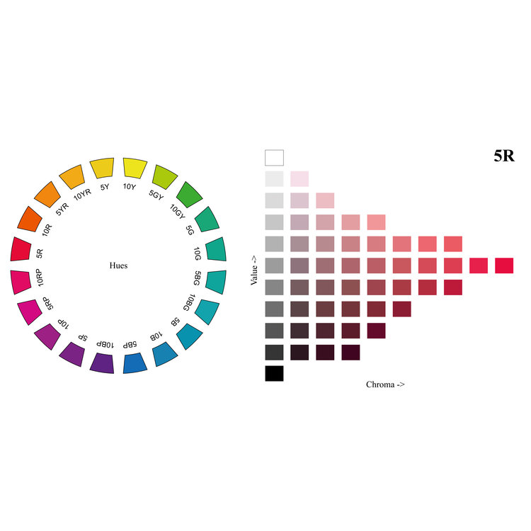
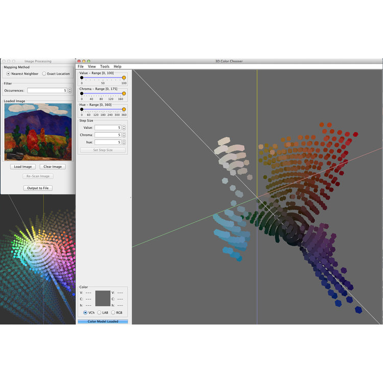
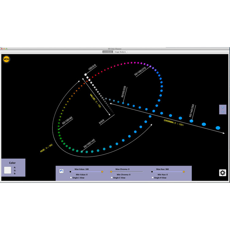
More than 100 years ago, Albert Munsell developed a method of quantifying color that was based on human color perception. He established that Value, Chroma and Hue provided a way of describing any color. Munsell first proposed the concept of identifying colors in 1915 by using a three-dimensional component model. His mathematical model was based on a five primary-hue system (red, purple, blue, green and yellow) and a set of 10 values (0 for black and 10 for white) with Chroma ranging from 0 (gray) up to 18 (greatest Chroma). The Munsell color system is still considered an excellent system for understanding color and the first to present color relationships three-dimensionally. However, his system is limited since there are only 10 units for Value, nine for Chroma, and 40 Hues to describe any color (Figure 14).
In professional practice, the tools used to identify, analyze and manipulate color are more sophisticated but still lack a level of precision and functionality that could benefit a range of fields in which color analysis is important. Currently, graphic, interior, fashion designers and others who work with pigments use outmoded color pickers or are relying on subjective judgments to select colors. They do this with little or no understanding of a color’s location in color space, and with little or no understanding of how the appearance of a specific color will change as a result of changes in illumination. This lack of understanding may stem from the lack of a useable tool for color selection.
The principles of color theory can be better presented using contemporary technologies. Having the ability to navigate a color model three dimensionally is key to understanding color. Currently, color is taught using textbooks written 50 years ago. Color-mixing is taught using subtractive primaries as a complete system. Many color-theory textbooks published in the past 10 years describe a system that combines both the subtractive primaries (CMY) with the additive primaries (RGB) into what has been called the YRMBCG system (Yellow, Red, Magenta, Blue, Cyan Green), but they remain two--dimensional depictions of three-dimensional space and cannot be made interactive by virtue of the traditional book format (Figure 15).
Parameters used by the Color Mapping project.
Value: Describes how the quantity of light reflected from an object compares to that reflected by black and that reflected by white. Black is the color that, in theory, absorbs all of the light falling onto it, and is assigned a value of 0 percent. White is the color, in theory, that reflects all of light falling onto it, and assigned a value of 100 percent. All remaining Values fall along an achromatic "gray" scale.
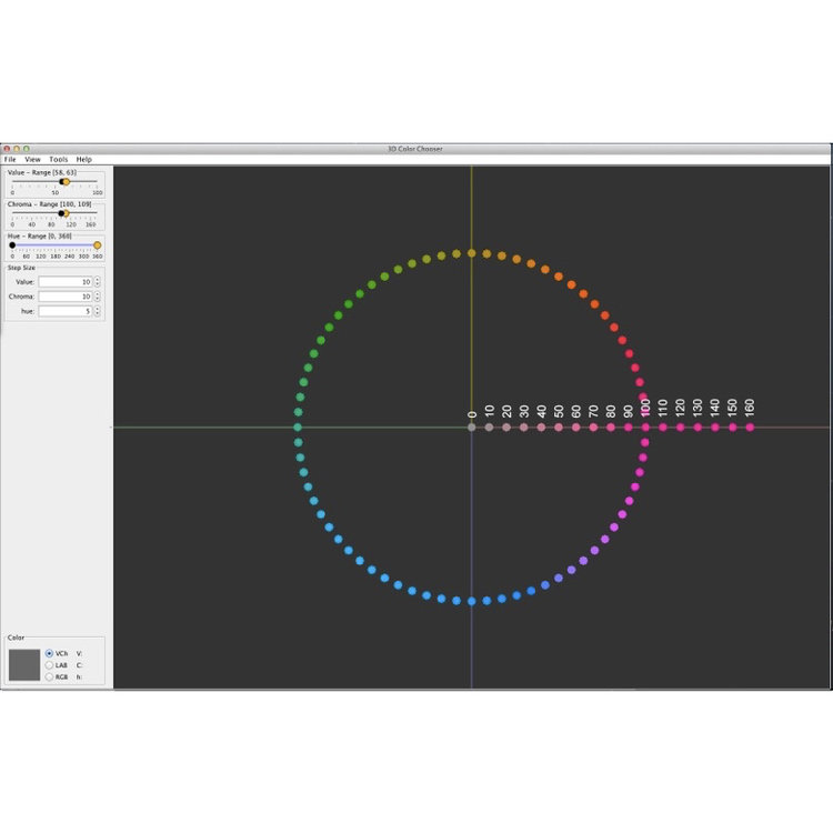
Chroma: The quality of color purity, intensity or saturation. For example: gray colors have very low chroma, while colors like candy apple red have a very high chroma. Starting at a value of 0, an achromatic gray, the higher the Chroma, the more intense the color.
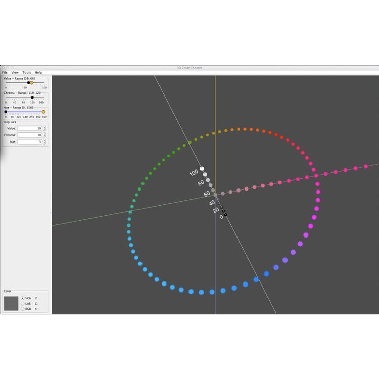
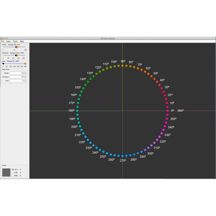
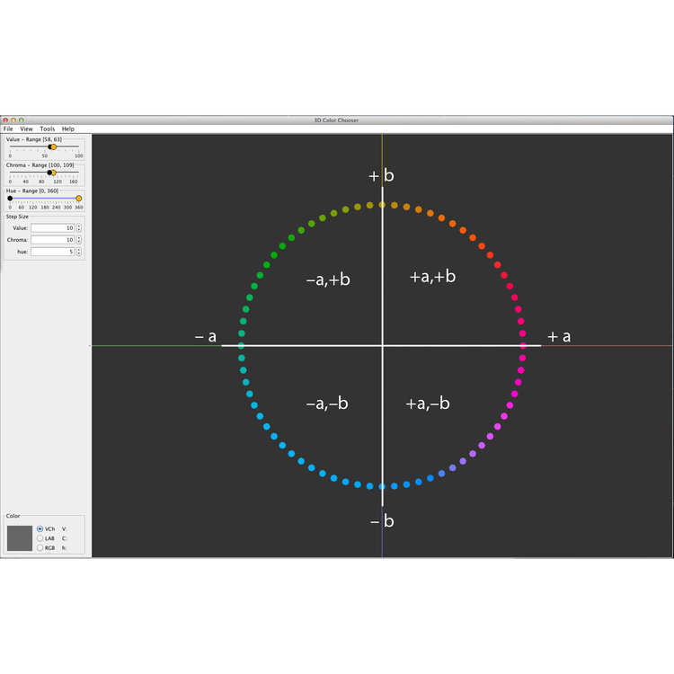
Hue: A partial description of a color by describing where in the visible spectrum it appears to fall. By using the wavelengths that correspond to the range of colors seen in a rainbow, red to yellow to green to blue, or a mixture of red and blue, the hue is constrained to fall in the range 0 degrees to 360 degrees as it moves continuously around a circle (Figure 16).


These parameters are the same as those available on instrumentation used to quantify the color of a sample and are commonly used in the pigment and color measuring industries for quality assurance.
To understand color relationships, it is necessary to look beyond two-dimensional models. The VCU Color Mapping Project is a collaborative effort between Robert Meganck, Matthew Wallin and Peter Martin to create a three-dimensional color visualization tool (Figures 17 – 21).
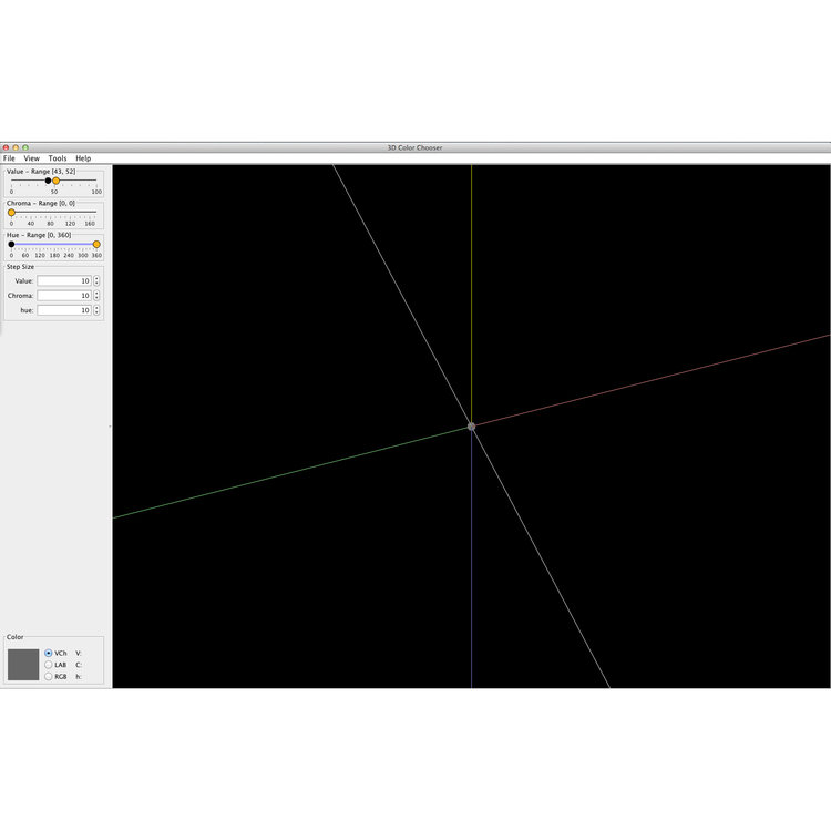
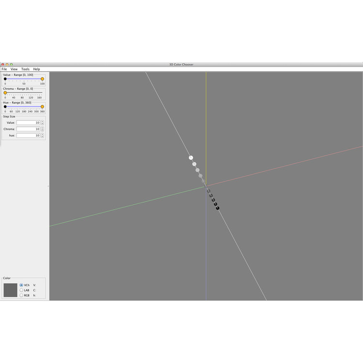
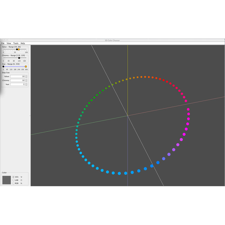
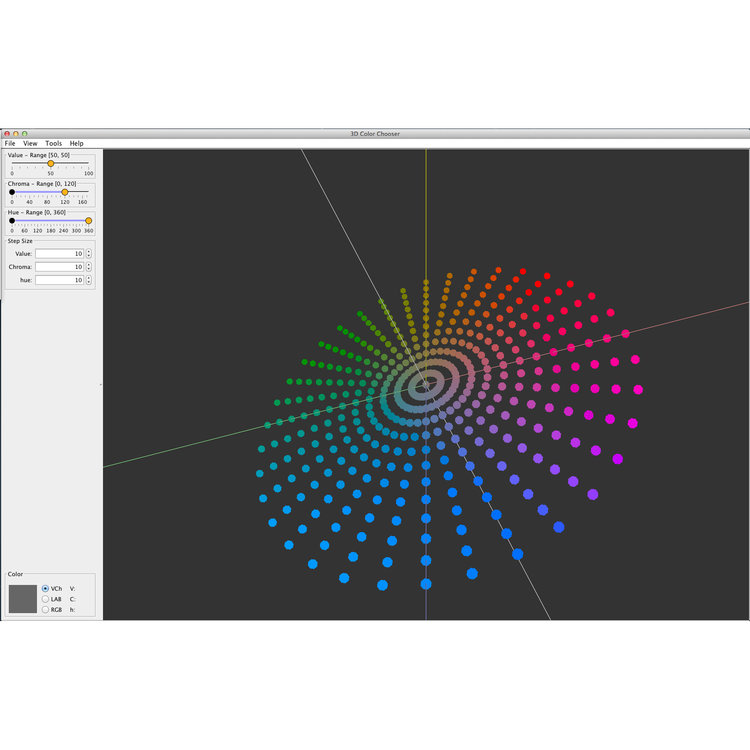
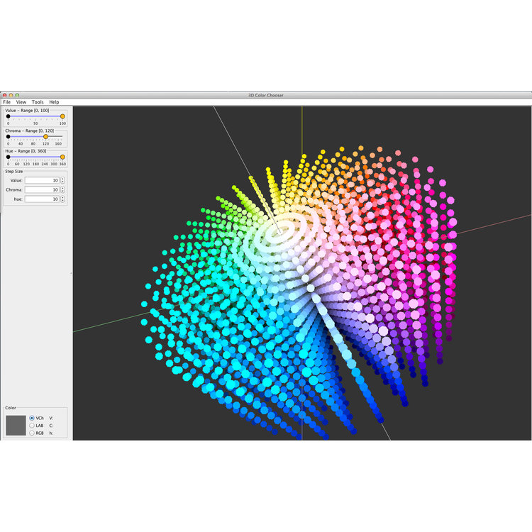
The color-space tool uses these three parameters to display color location and relationships. To provide greater accuracy and specificity, the color-space identification system plots a color numerically on a Cylindrical Cartesian coordinate system, which uses percent (0 percent - 100 percent) to identify Value — a perpendicular scale (0-100+) to identify Chroma, and an angular rotating scale (0 degrees – 360 degrees) to identify Hue. The color-space diagram place the far reddish end of the visible spectrum at 0 degrees hue, while the violet end of the spectrum falls around 300 degrees. Similar to traditional color wheels, the missing purples and magentas fill in the remaining 60 degrees (Figures 22-24).
The color tool developed for the Color Mapping project identifies and describes colors based upon human perception, differing substantially from the subtractive and unscientific approaches most commonly employed in education and practice.
Additionally, any color model that attempts to go beyond a basic pallet also will need to expand the vocabulary used to identify a specific color. This, of course, leads us to understand the limits of using terms such as red, light red, dark red, blood red, candy apple red and whatever adjectives one could add to the red to add specificity. There simply are not enough words to describe the many million colors distinguishable by human vision.
The only accurate way to describe color would be to use mathematical identification. Mathematics provides an unlimited amount of specificity. Although most humans cannot distinguish a single degree shift in value, chroma or hue, mathematics allows someone to specify a half of a degree shift. Math has no limitations; any number can always be made more specific through the use of additional decimal points. Additionally, while language is not universal, mathematics is. The number 10 is the same in English, French, Japanese and every other language.
Although the color-space model can show the location of any color with its VCH (Value, Chroma, Hue) coordinates, the model remains theoretical in that there are practical limits to what computer monitors can project and what color differences the human eye can perceive.
Gamut
Different color spaces are identified as gamut spaces. Think of it this way: If you were given a set eight crayons, the gamut space for that set would consist of only the colors that can be reproduced using these specific crayons — basically one blue, one green, etc. If you were to increase this set adding an additional eight for a set of 16 different crayons, the color-gamut space would increase. Each time you add a crayon color, you increase the colors that can be represented and thereby increase the gamut space.
The full range of colors that a person can perceive is known as the human gamut. Any mathematical model used to display color space most likely would use either a screen or printed material. The range of colors that can be displayed by these media is controlled by their primary colors and is a fraction of the colors perceptible with human vision. It is important that color maps display colors that fall within human gamut space, even if they cannot be represented colorimetrically because of the limitations of the display media gamut. Both RGB and CMYK are limited gamut spaces.
While Figure 21 shows the full color space, it remains theoretical, as the color monitor used to display the diagram was limited to an RGB gamut space (Fig. 25).
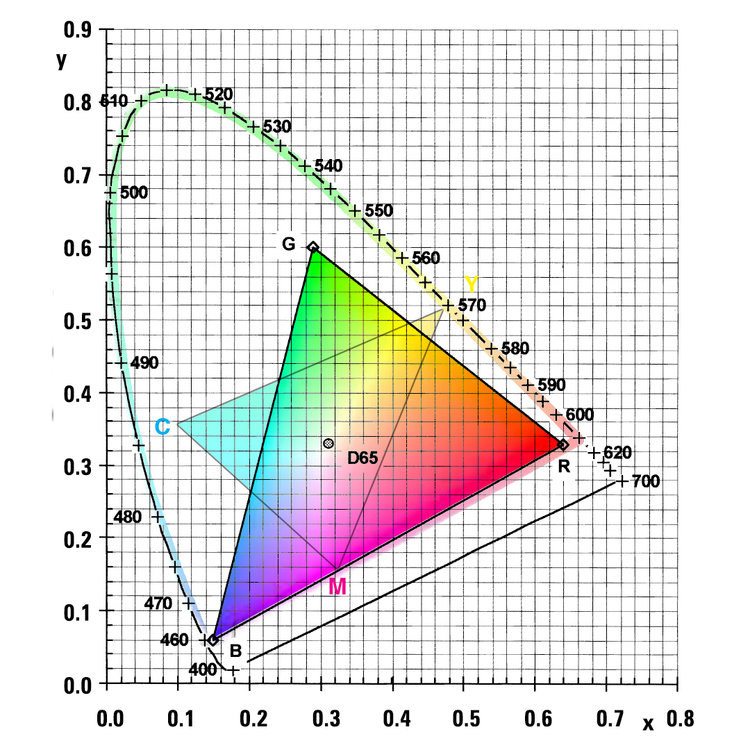
The CIE 1931 color space chromaticity diagram displays the limits of RGB and CMY(K) space within the limits of human gamut space. The outer (shark fin) shape displays the boundary of human perception, while the two intersecting triangles represent RGB and CMY(K) spaces.
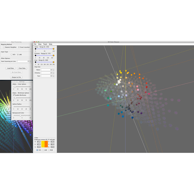
Any color or group of colors can be plotted using a VCH 3D model to show their location within human gamut space. Figure 26 displays the location of all the pigments in the Gamlin oil color set. It should be noted that the complete gamut space could not be shown as many of the colors would fall outside of the monitor’s RGB gamut. For these colors, it is still possible to show their location, but it should be noted that they fall outside of RGB gamut and the RGB representation is only an approximation of the true color. Thus, many paintings printed in books cannot be reproduce accurately because the film or scanner used to create a copy of the painting is limited by the RGB range of colors and further limited by the CMYK (printing) gamut.
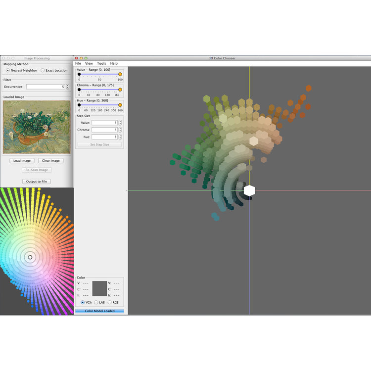
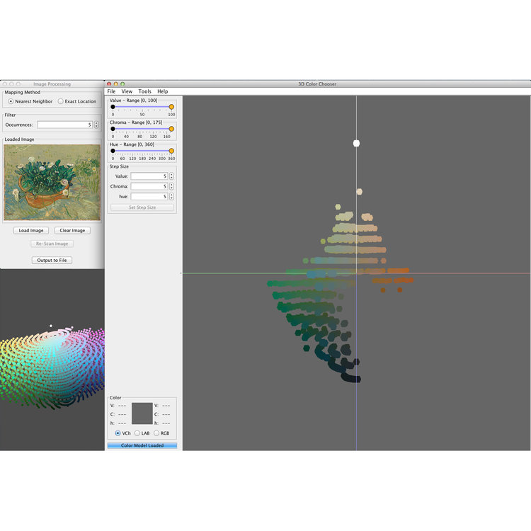
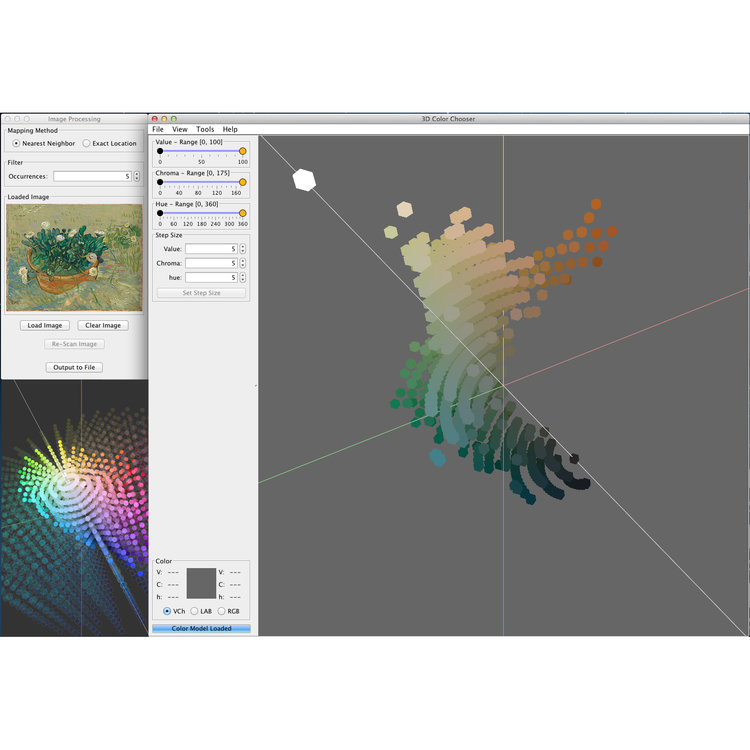
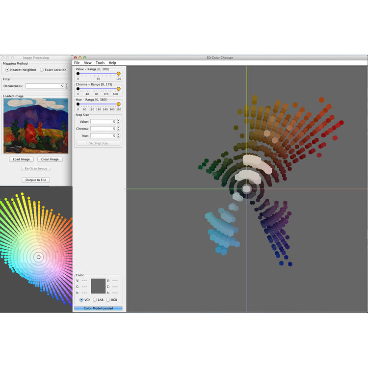
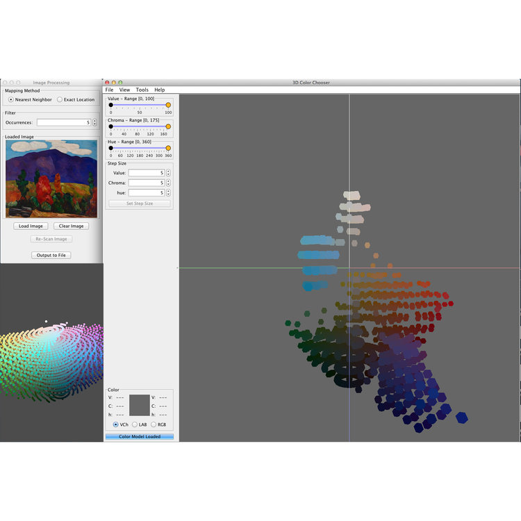
Figures 27-32 compare the color space of two paintings from the collection of the Virginia Museum of Fine Art. The paintings are “Daisies, Arles” by Vincent Van Gogh (Figures 27- 29), and “Franconia Notch” by Marsden Hartley (Figures 30-32). The paintings were imported as high-resolution jpg. Images. Each set of three shows: 1. “top view” – colors present when viewed down the Value axis from the value of 100 percent (horizontal and vertical axis show chroma and hue; 2. A “front view” –the vertical axis displays the axis value scale for the darkest at the bottom to the lightest at the top.); and 3. “Angled view” – at a step size of five for each of the VCH coordinate and omitting any color occurring in less than five pixels.
Additional mathematic notation systems
The International Commission on Illumination (CIE) was founded in 1913 to serve as an international authority on light, illumination, color and color spaces. Since then, technology and equipment have been developed that can measure color accurately and compare it to defined standards. The CIE L*a*b* mathematical model of color space goes a long way towards having uniform perceptual difference for equal separations in color space, and it has seen considerable acceptance in industry and science (Figure 33).
The three parameters used to describe the location of a color in three-dimensional space are: Lightness (L); how the color can be seen as red or green (a*); and how the color seems to be blue or yellow (b*).
The parameter Lightness compares the light reaching the detector with that from a perfectly white object (all incident light being reflected) or from a perfectly black absorber.
The parameters a* and b* describe the appearance or hue of the color. Zero values imply no perceptually detectable color, positive values show a red or blue appearance respectively, and negative values show a green or yellow appearance respectively.
Cyan, Magenta, Yellow and Black (CMYK) employ four translucent colors to produce “full-color” images and is the standard used for offset printing. The system uses dots in varying sizes of each of the four colors to create tonal effects: small dots create light color when printed on a white or light paper; larger dots are used for darker colors. The system is subtractive, with each dot absorbing a portion of the spectrum and reflecting the other portion. Thus, the more ink, the more absorption and, in general, the darker the color.
RGB color coordinates use a combination of Red light, Blue light and Green light to create all of the colors visible on monitors and all computer visualization systems. Each pixel is an additive combination of red, green and blue light sources. With a standard RGB display there is a range of 256 possible values for each Red, Green and Blue coordinate. As an additive system, the higher the value the more color. A value of 0 red, 0 green and 0 blue would indicate the absence of color and appear black. Values of 255 red, 255 green and 255 blue indicate the presence of a maximum value of each base color and thus appear white. The number of colors that a monitor can produce is 256 red X 256 green X 256 blue, or 16,777,216 colors but as explained earlier human vision is not able to distinguish this fine a color resolution. In computer files the intensity of each color is represented by a byte of two hexadecimal values that cover the range 0-255.
The Pantone Matching System (PMS) is a system whereby printers can mix some 1,867different spot colors from a set of 14 base pigments. Developed in the 1950s, the Pantone system was widely used by designers extensively through the 1980s. However, it lost its popularity with the development of computer design systems like Adobe Photoshop, Illustrator and InDesign. As these systems made extensive color choices and color separations available on most desktop systems, the need for premixed color diminished. Another problem with the Pantone system is that the numbers used to identify a specific color are simply numbers — with no reference to value or chroma. The PMS system does however, include many colors that cannot be printed in CMYK or visualized in RGB gamut space, so it’s gamut space is larger than the other two.
The VCH system should become the industry standard in that it is not output specific and combines RGB, CMYK and La*b* into a single understandable numbering system (Figure 34). Additional colors that fall outside of RGB space can still be identified by location within human gamut. Although no computer system should try and display a color that falls outside of RGB space (like some of the colors from PMS or other pigment sets) as the color displayed will not be accurate, the VCH system can still show their location relative to other colors that fall within human gamut space. Color differences or color sample quality assurance can be done in a three-dimensional space rather than relying on multiple two-dimension charts. Since the VCH model is based on the mathematical identification of color rather than using perceptual differences, color specificity is not limited by the range of common color names existing in any language. Figure 35 displays the same 20 “red” circles from Figure 1. However by labeling each with it VCH coordinates it is easy to identify which are the lightest/darkest (value: first set of numbers), the dullest/brightest (chroma: second set of numbers); and which are warmest/coolest (hue: third set of numbers
Summary
Color is very important to people since it is the basis of vision, the sense by which we distinguish objects and assign them distance and shape. Telling someone that an object is red is a useful — but very imprecise. If a large number of people were asked to provide a sample of red material there would be a large number of different colors provided, distinguishable from each other, but all of which would still be classified as red. Art, science, medicine, business and industry all need to have a more precise and consistent way of defining a color since it is a primary means by which we define our world, and it is a tool by which we make quality judgments. A tomato that has shades of green or black is likely to stay on the shelf for a very long time. Manufacturers establish very strict constraints on the color of a product since any item perceptually different in color is likely to be viewed by consumers as inferior.
It is also of great importance to be able to measure or predict how the color of an object or image changes with time, processing parameters, storage conditions, or lighting conditions since any variation can indicate that some form of intervention is required. Teeth yellowing over time can indicate a need for a diet change or improved dental hygiene. A change in the foliage color can indicate inadequate care or the presence of pests. Darkened corn flakes can show that the processing ovens are set at too high a temperature. And fading works of art in a museum can show that they are being exposed to too much illumination.
We would love to hear from you to discuss color, potential uses for our software, partnerships, etc. We are both current and former professors at Virginia Commonwealth University and can contacted via email by clicking on the image below.

WHAT IS COLOR?
Color is the range of electromagnetic radiation to which the eye is sensitive. The distribution of wavelength of the incoming light is the property that creates the perception of color. There is a continuum of colors that can be perceived by human vision that is demonstrated in nature by the phenomena of the rainbow produced by sunlight interacting with raindrops. The colors vary from many shades of red (600-750 nm. wavelength), through orange and yellow (570-600 nm.), through green (490-570 nm.) to blue and violet (380-490 nm.).
We are developing a color model that will identify and describe colors based upon human perception. It utilizes three parameters; the color or hue or wavelength (does it seem to be red, or green or blue or any other general color term); the purity, or saturation or chroma which describes how much of the color appearance can be attributed to a unique hue (or color or wave-length); and the value or brightness or lightness, which relates a color to an equivalent achromatic scale. The latter parameter describes how much of the incident light is being reflected compared to a white surface (100%) or to a black surface (0%).
We are creating an interactive, web based software and mobile application tools that can be used by artists, engineers, scientist, educators, medical personnel, the military and students in defining how colors relate and correspond to one another. The model itself would function to allow for the mapping of specific colors, color space and all its complements in various formats.
Color identification by means of common names (red, blue, etc.) is inadequate for the identifica- tion of the spectrum of colors available to us. In order to provide greater accuracy and specificity, we are proposing a color identification system based on a colors location on a Cylindrical Cartesian coordinate system, which would use degrees (0 - 360) to identify hue, a scale (0- 100+) to identify chorma/saturation, and percent (0%-100%) to identify value/lightness/brightness. A bright orange might be identified as 30h, 82c, and 78v. Hue is an identification of a spectral region, chorma/saturation describes the purity of a color, and value/lightness/brightness identifies a color relative to black (the absence of all light) and white (the presence of all light).
It may be easiest to describe our model as a “point cloud” or a mass of floating marbles (each marble identifies the location of a specific color) with which the viewers can navigate around and through, allowing them to not only see the location of a specific color, but also see its’ location in relation to all other visible colors.
Color is a universal concern of all design, art and science disciplines. It is one of the most widely misunderstood visual principles. The genesis of this misunderstanding stems from the fact that most people believe that color is a physical property of an object rather than the human percep- tion and interpretation of visible wavelengths (consisting of hue, saturation and value) that emanate from, or pass through an object under illumination. For the most part, color systems are still being presented as two-dimensional or as a two-dimensional depiction of three-dimensional models.
GLOSSARY
achromatic - Without color so that it ranges from black to white through various shades of gray.
black - The color that in theory absorbs all of the light falling onto it. This is very hard to achieve in practice although carbon black comes very close.
brightness - Attribute of a visual sensation according to which an area appears to emit more or less light.
Cartesian coordinates - A way of describing a position in space related to its distance from three intersecting planes that are perpendicular to each other and pass through a single point, the origin. These coordinates resemble a cube with the coordinates being the lengths of the sides.
chroma - Attribute of a visual sensation that permits a judgement to be made of the degree to which a chromatic stimulus differs from an achromatic stimulus of the same brightness.
chromaticity diagram - A picture of the possible range of color appearances that can be produced at a specific value or intensity level.
CIE - Commission Internationale de l'Eclairage. An international collaboration that has existed for 100 years to bring standardisation to the field of color. It has defined the average human visual response, several standard illumination sources and the mathematical relationship between many models describing color perception.
color - The range of light to which the normal human eye responds. These are the same colors that appear in a rainbow although there can also be mixtures.
color space - The range of light to which the eye is responsive. This allows a variation in value (intensity), in hue (color appearance) and saturation (chroma or how far it is from a grey scale). A color space should allow an observer to consistently evaluate color differences.
cylindrical coordinates - A way of describing a position in space related to how far it is above the base of a cylinder, how far it is from the central axis and how far it is rotated around the circlar cross-section of the cylinder.
dye - A water soluble substance used to color material from an aqueous solution.
electromagnetic radiation - Energy that travels through space in the form of interacting electric and magnetic energies. All objects emit a wide range of electromagnet radiation and the eye is only sensitive to a small fraction of it, termed the visible spectrum. Some animals are able to detect radiation outside the visible spectrum, either in the infra-red (heat or longer wavelength) or in the ultra-violet (shorter wavelength).
gamut - The part of the complete 3-dimensional color space that can be observed. Different media have a gamut smaller than the gamut detectable by the human eye. Television, or monitors, generate color by combining light at different intensities that is emitted by spots of blue, green and red phosphors. Printed color images create color by varying the quantity of deposited magenta, cyan, yellow and black pigment or dye.
hue - A partial description of a color by describing where in the visible spectrum it appears to fall. By using the wavelengths that correspond to the range of colors seen in a rainbow, red to yellow to green to blue, or a mixture of red and blue, the hue is constrained to fall in the range 0 degrees to 360 degrees as it moves continuously around a circle.
illumination - The quantity of light that falls onto an object. This varies according to the distance from the light source and the type of light source, its temperature, and its means of generating light in the visible spectrum. An illuminant is specified by the relative power distribution across the wavelenths of the visible spectrum. Standard sources include D65, daylight as represented by a black body radiator operating at 6500 degree Kelvin, and the F series that represent various fluorescent sources.
lightness - Attribute by which a perceived color is judged to be equivalent to one of a series of greys ranging from white black. (CIE International Lighting Vocabulary).
pigment - A water insoluable material dispersed in the material it colors.
pixel - An abbreviation for "picture element". It is the smallest addressable element of a display device. At any location on a screen there are three phosphor dots, red, green and blue whose relative intensities are varied to produce the desired color appearance. In printing it is created by the superposition of deposits of several pigments.
perceptual color - This is the chromatic interpretation of the color signals received by the brain. It is effected by the spatial environment surounding the specific object, the overall luminance levels, the light adaptation of the eye, and the human expectation of what is being viewed. This can lead to many optical illusions.
saturation - The colorfulness of an object judged relative to the light intensity falling on it. Within the range of normal color vision an object will retain the same saturation as the light level is changed since both the chromaticity and the lightness change as the level of light is changed.
value - Describes how the quantity of light reflected from an object compares to that reflected by black (0%) and that reflected by white (100%). This is a term used in the art environment and can also be called relative brightness.
wavelength - An accurate way of describing the hue of a color. Any pure color from the visible spectrum can be defined by its wavelength which is the physical distance between successive peaks in the waveform.